LEONARDO RINALDI
 1
1
 2
2
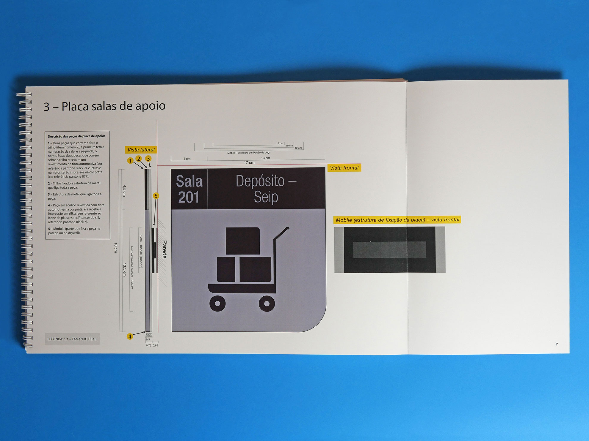
 3
3
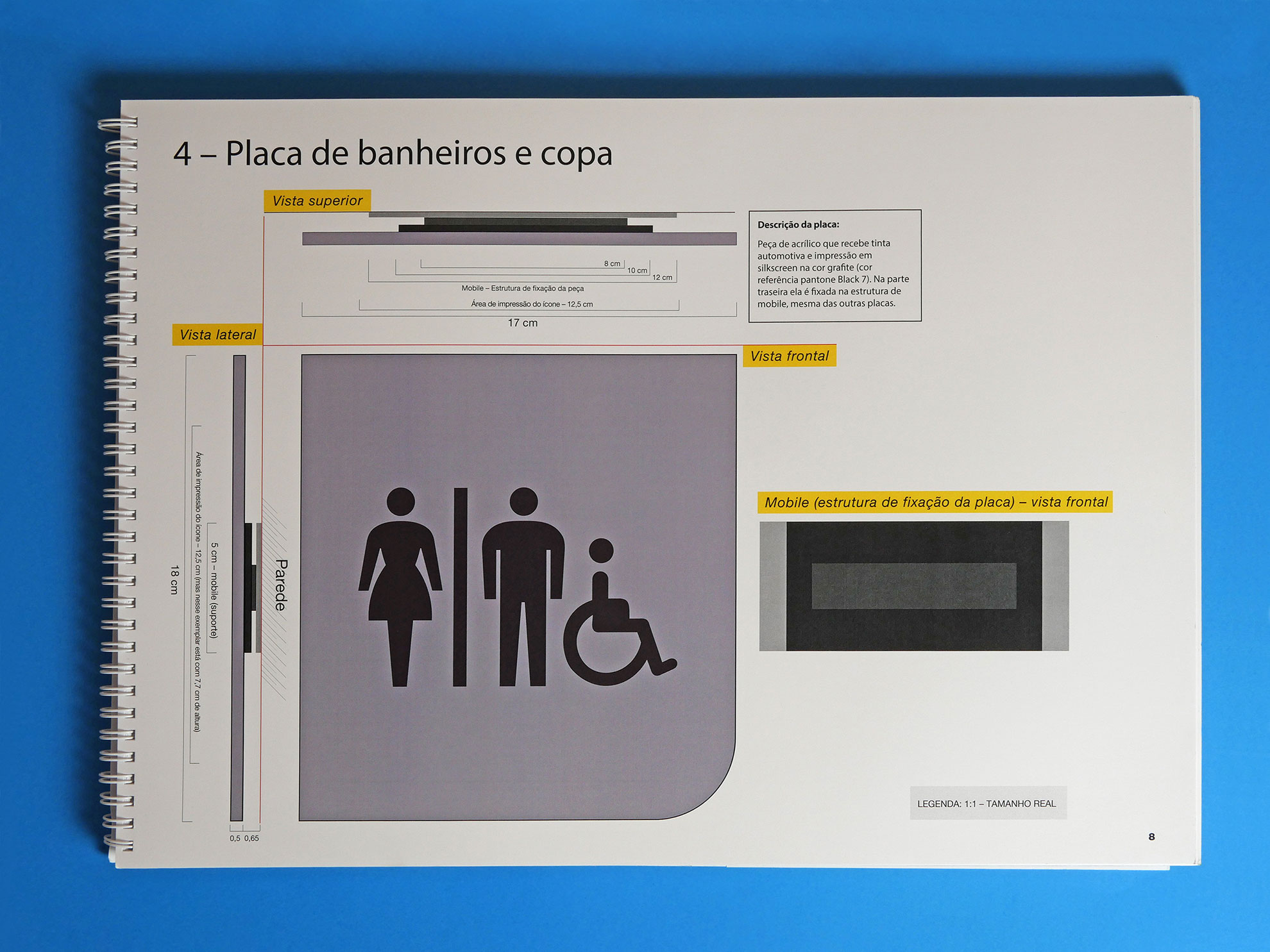
 4
4
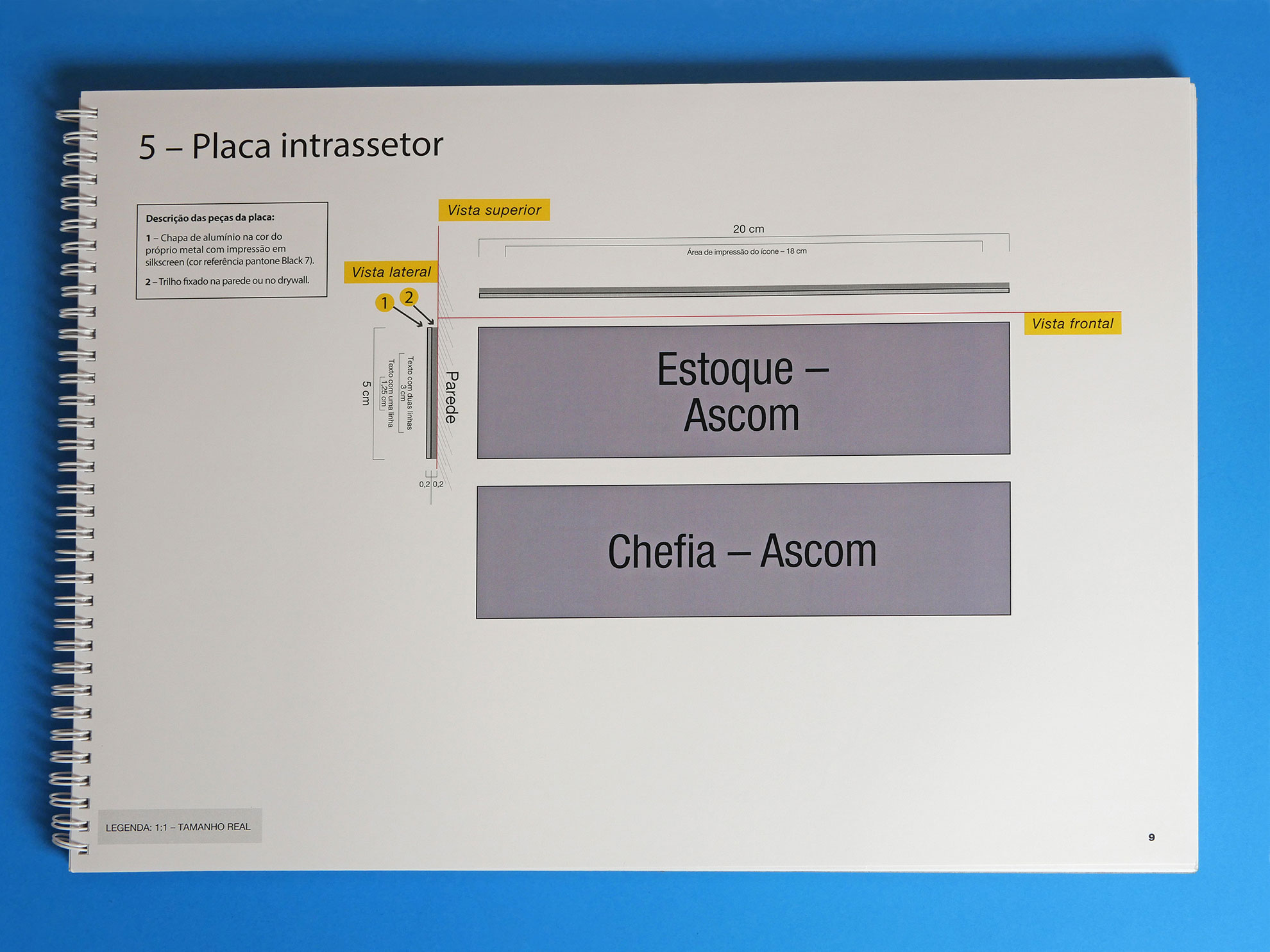
 5
5
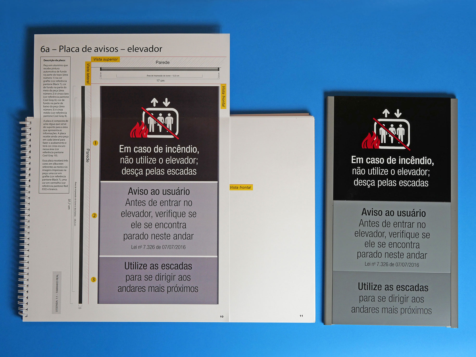
 6
6
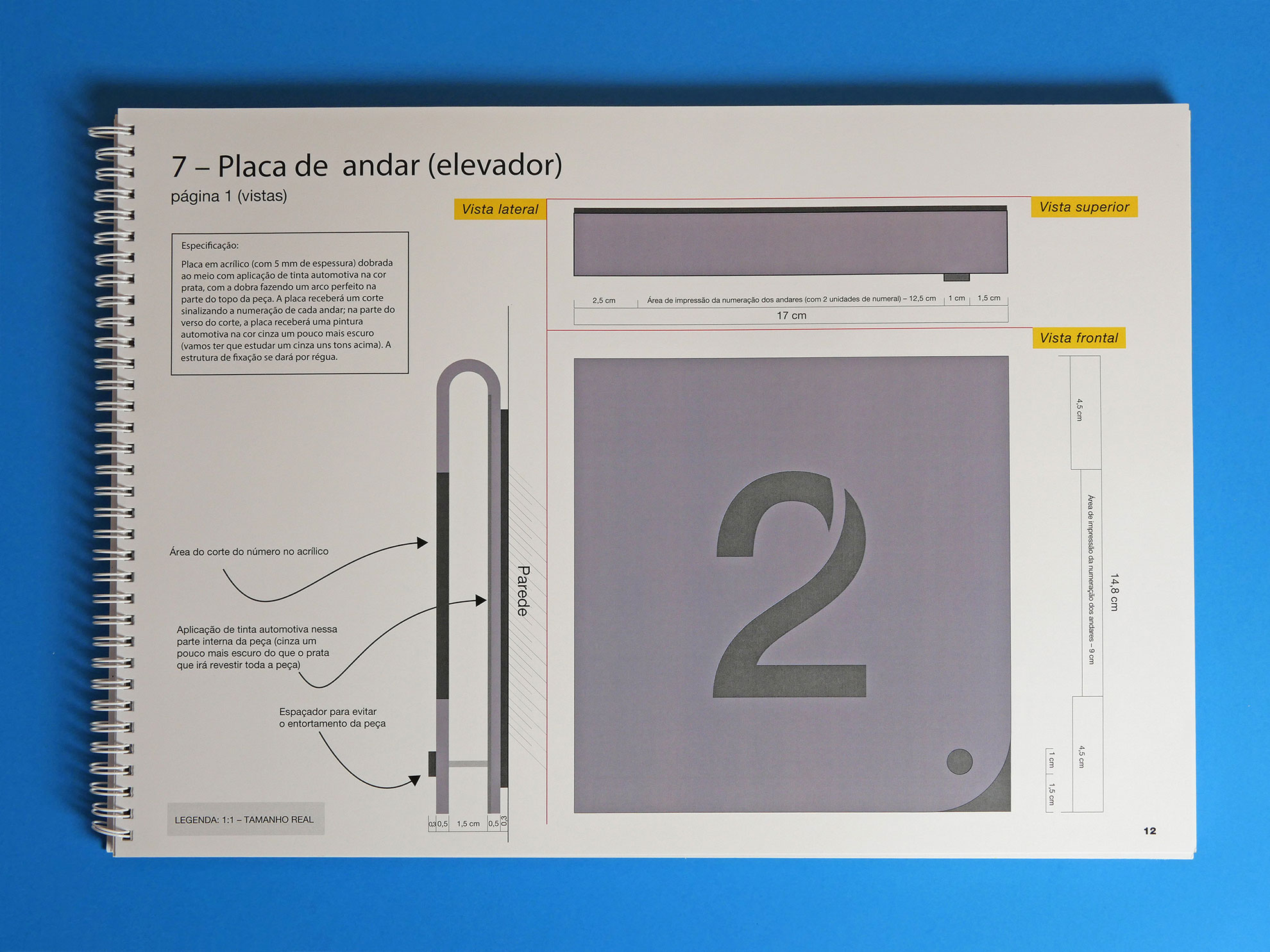
 7
7
 8
8
 9
9
 10
10
 11
11
 12
12
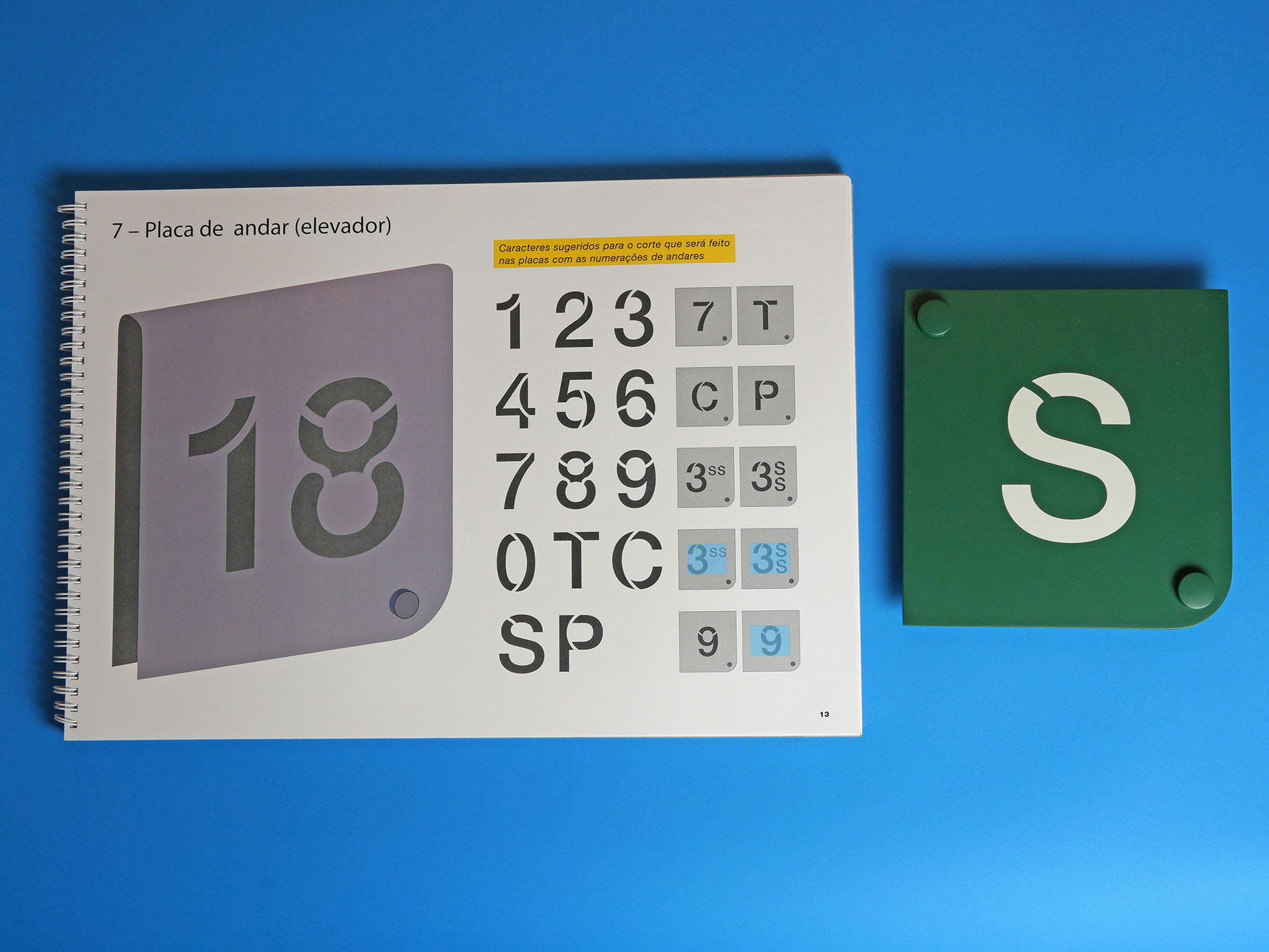
 13
13
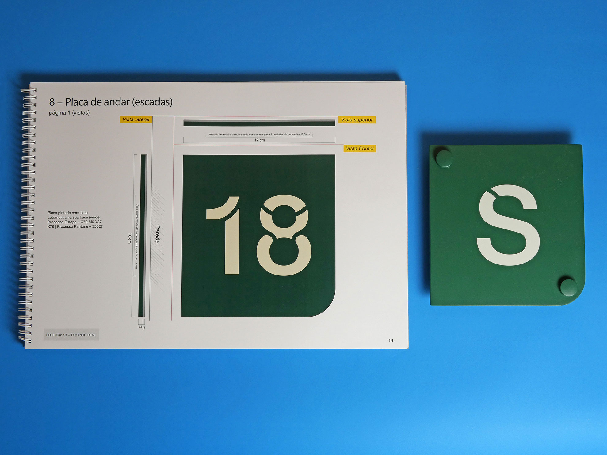
 14
14
 15
15
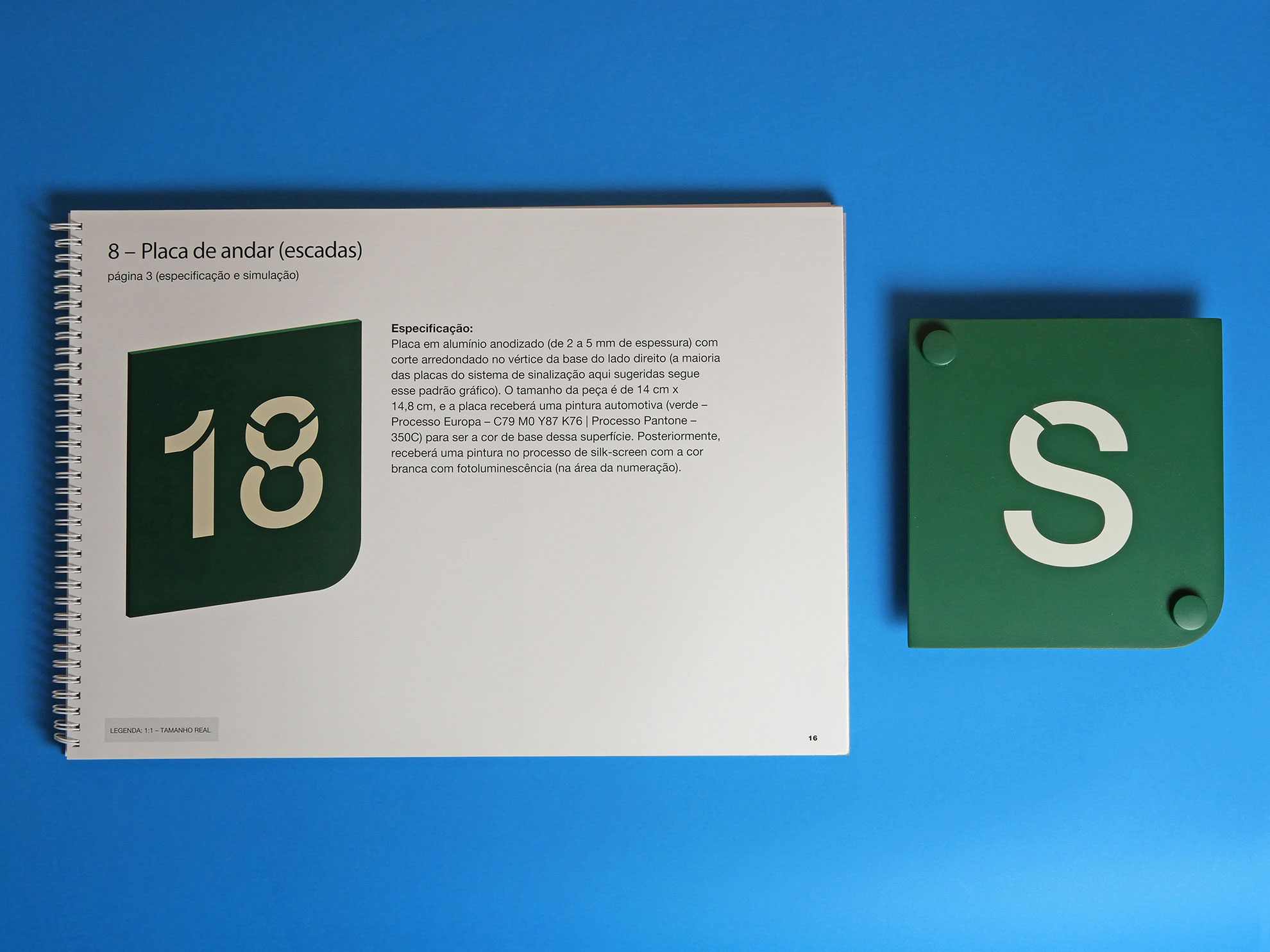
 16
16
 17
17
 18
18
 19
19
 20
20
 21
21
 22
22
 23
23
 24
24
 25
25
 26
26
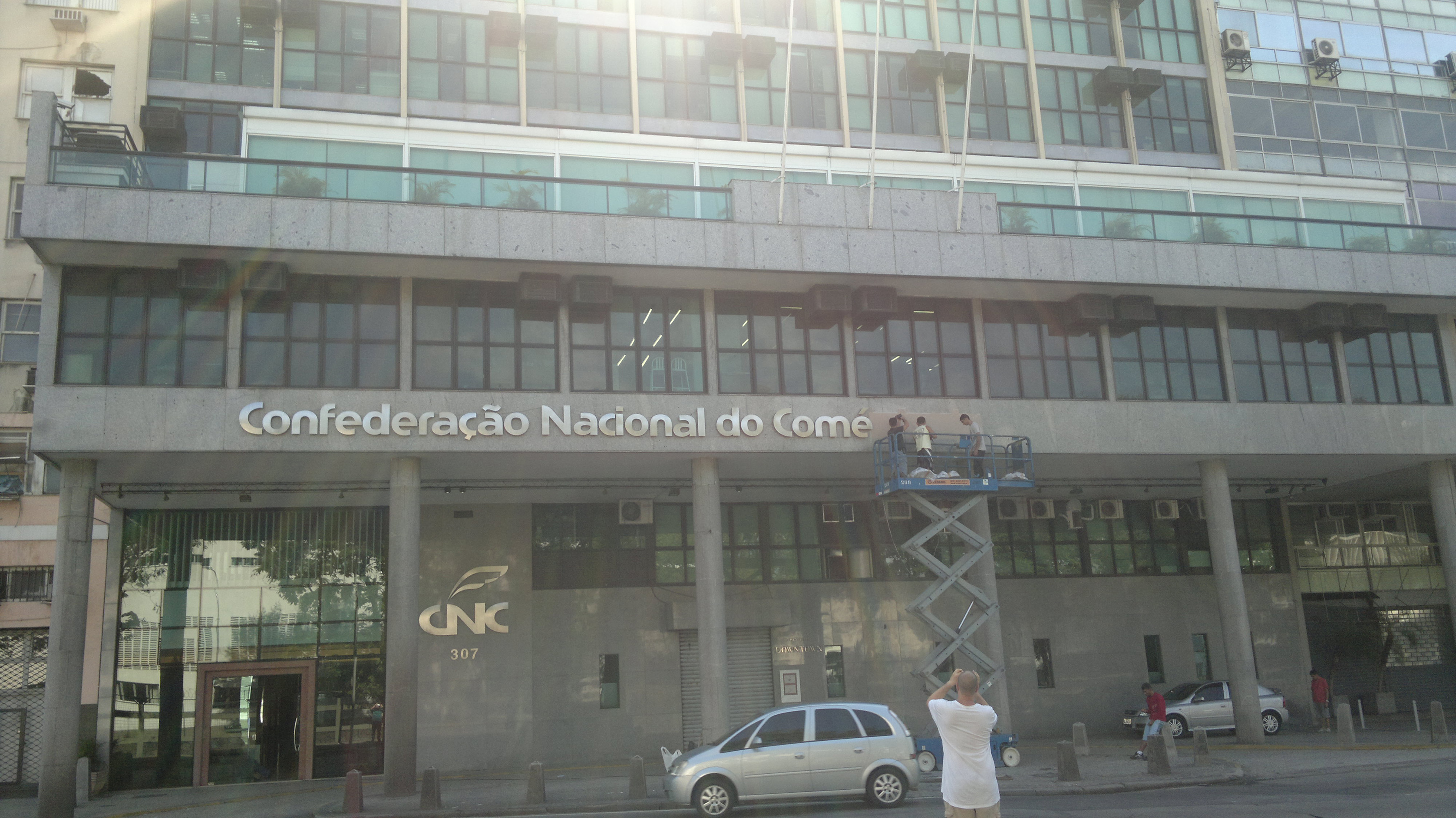
With the rebranding of the entity at the end of 2012, it created a necessity for a new signage’s project.
After I had thoroughly analyzed every space in the two buildings, I created a report with photos and observations to serve as a basis for carrying out this project. I have attended meetings with directors, the administrative department, etc., and conducted benchmarking in similar projects (Sesc-DN, Senac-DN, CNI buildings in Brasília, the new building and the old one). The project that the National Confederation of Industry (CNI) had implemented for its new building used a modular signage system, and this really has caught my attention, as one of the main challenges for a trade union entity is the political aspect – leadership changes can occur, leading to alterations in the names of sectors, departments, going to another rooms, etc.
I have created a basic brief to be followed, I analyzed the entities those I had visited and the current CNC project, comparing them and highlighting the following criteria:
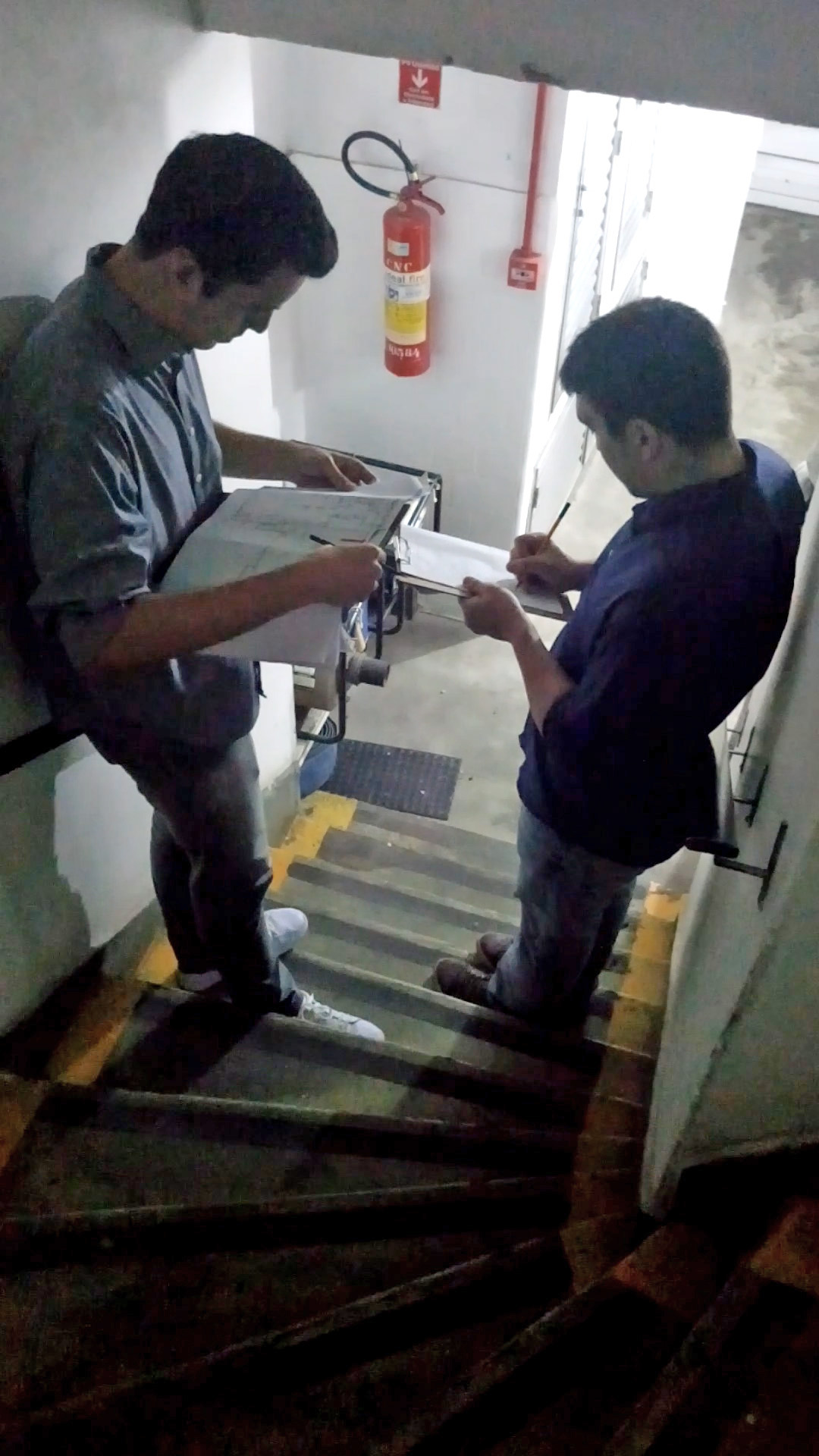
Following these initial stages, I had contacted the company that had produced the modular signs for the new CNI building, I have studied their entire production process and made technical visits to the company, identifying new requirements for the project’s specifications and design:
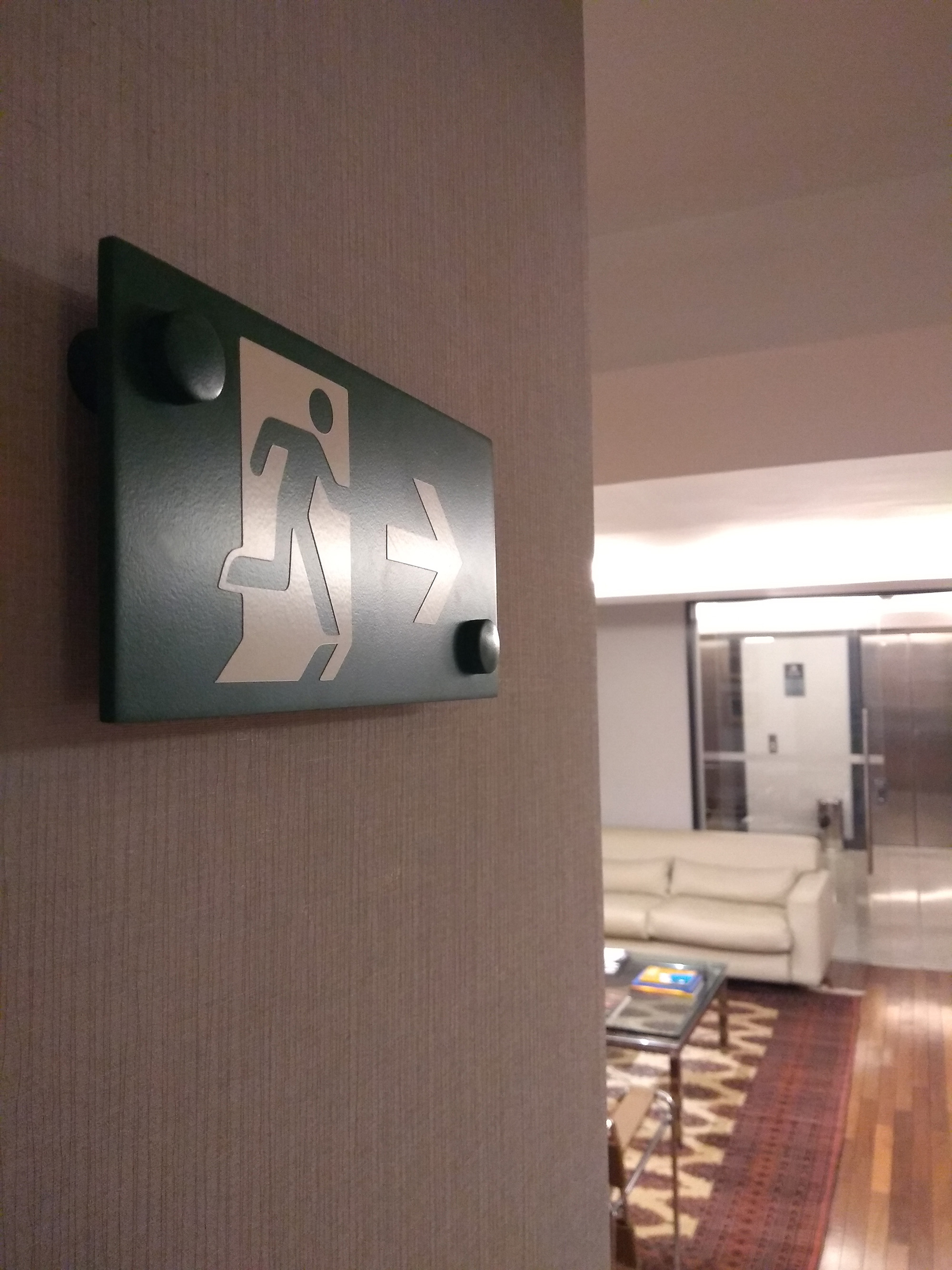
The focus now turned to concept. I have taken the concept of ‘Object Theory’, a subject of this class that I had studied during my graduation: the duality between physical products, an analogy between the ‘shell’ and the ‘egg’ – that is, either closed or open physical products. I have conceived of all the signs as ‘shells’, open; the environments of these two buildings are heavy, and so it has been necessary to bring a sense of lightness along with the signs. We have needed to create a prototype of each component, so I gone to Carplac (the company that has done the installation and produced the pieces of the project for the new CNI building in Brasília).
Another key aspect of the project has been to break it down into stages to facilitate its implementation and approval. These stages have been defined in consultation with the Head of the Administration Department and the entity’s management:
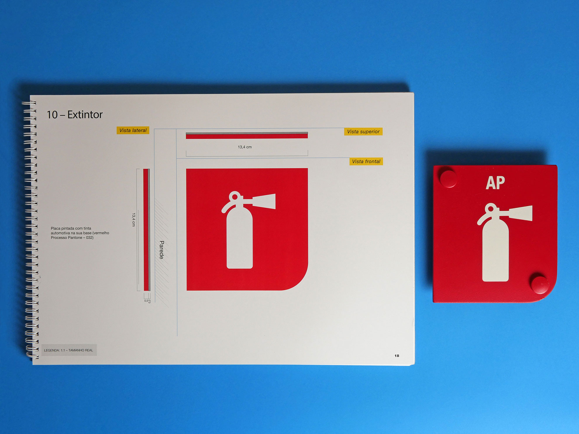
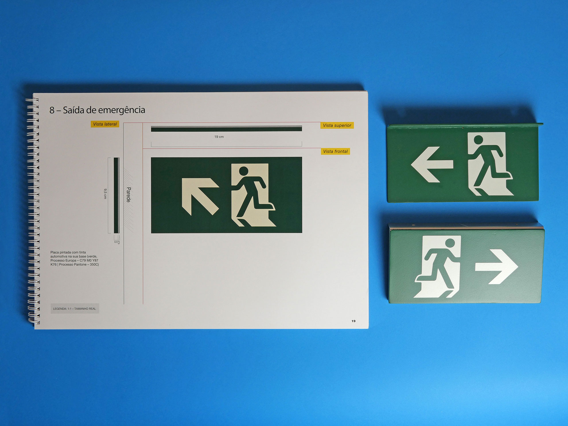
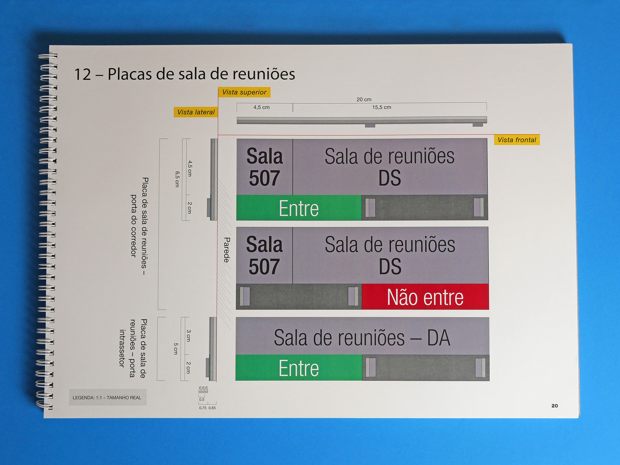
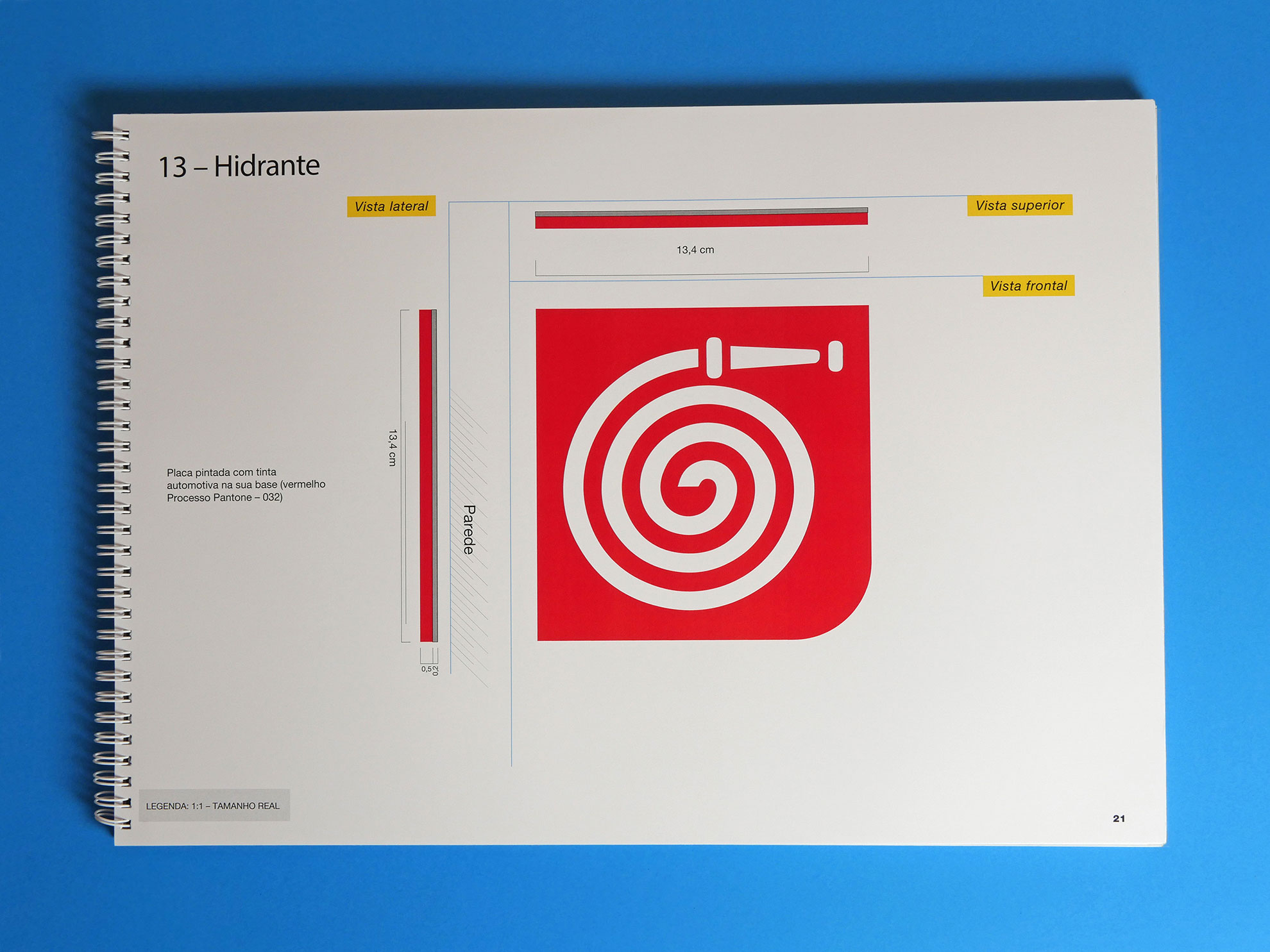
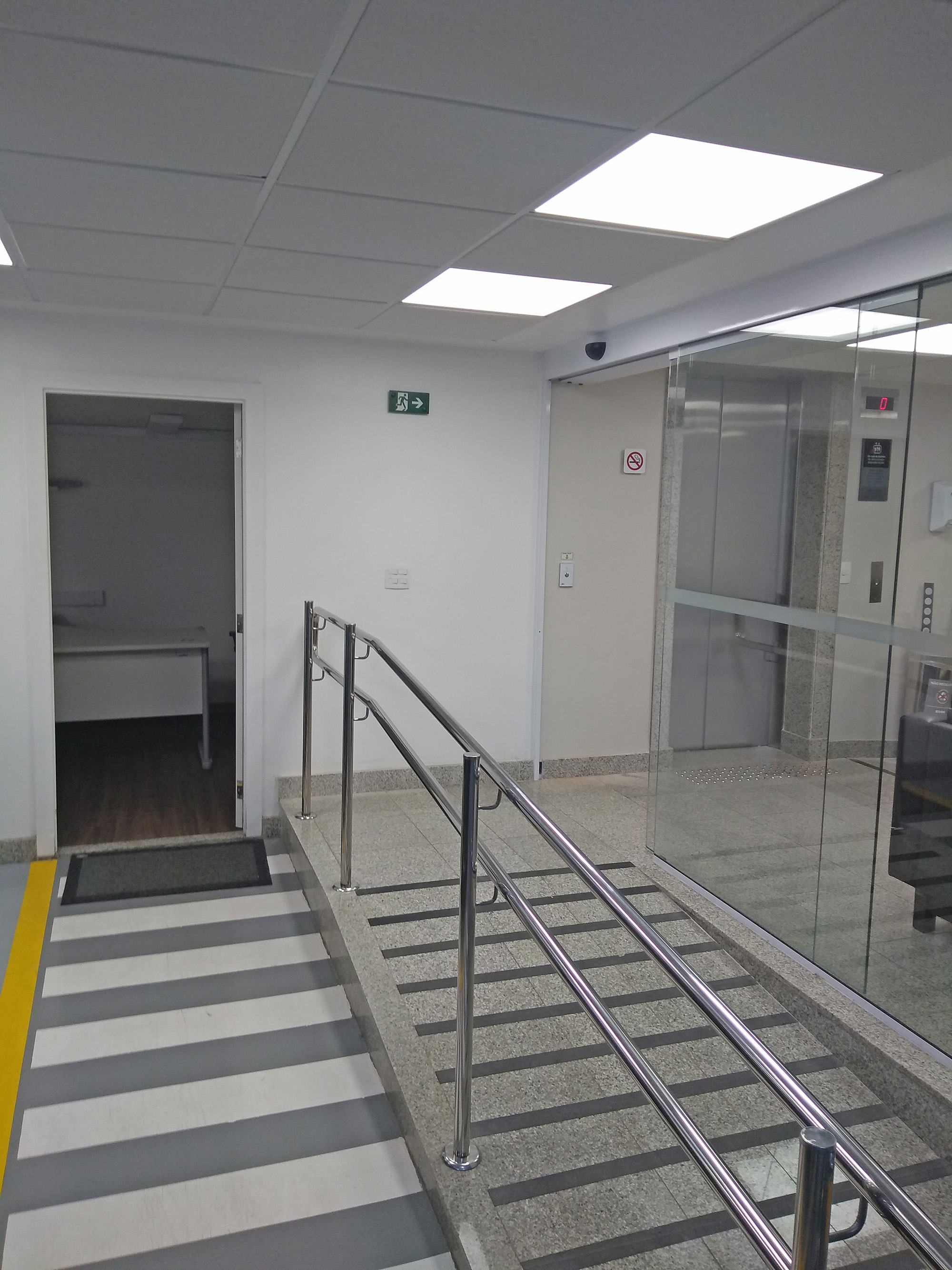
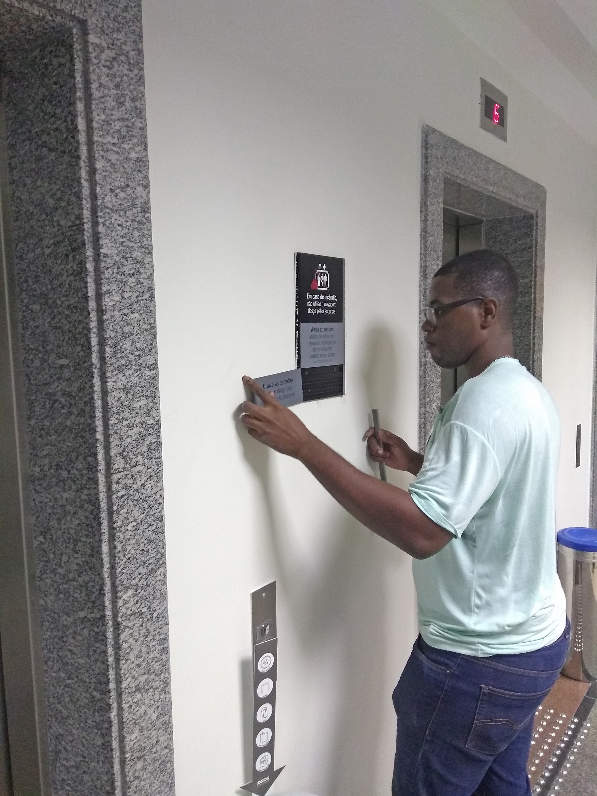
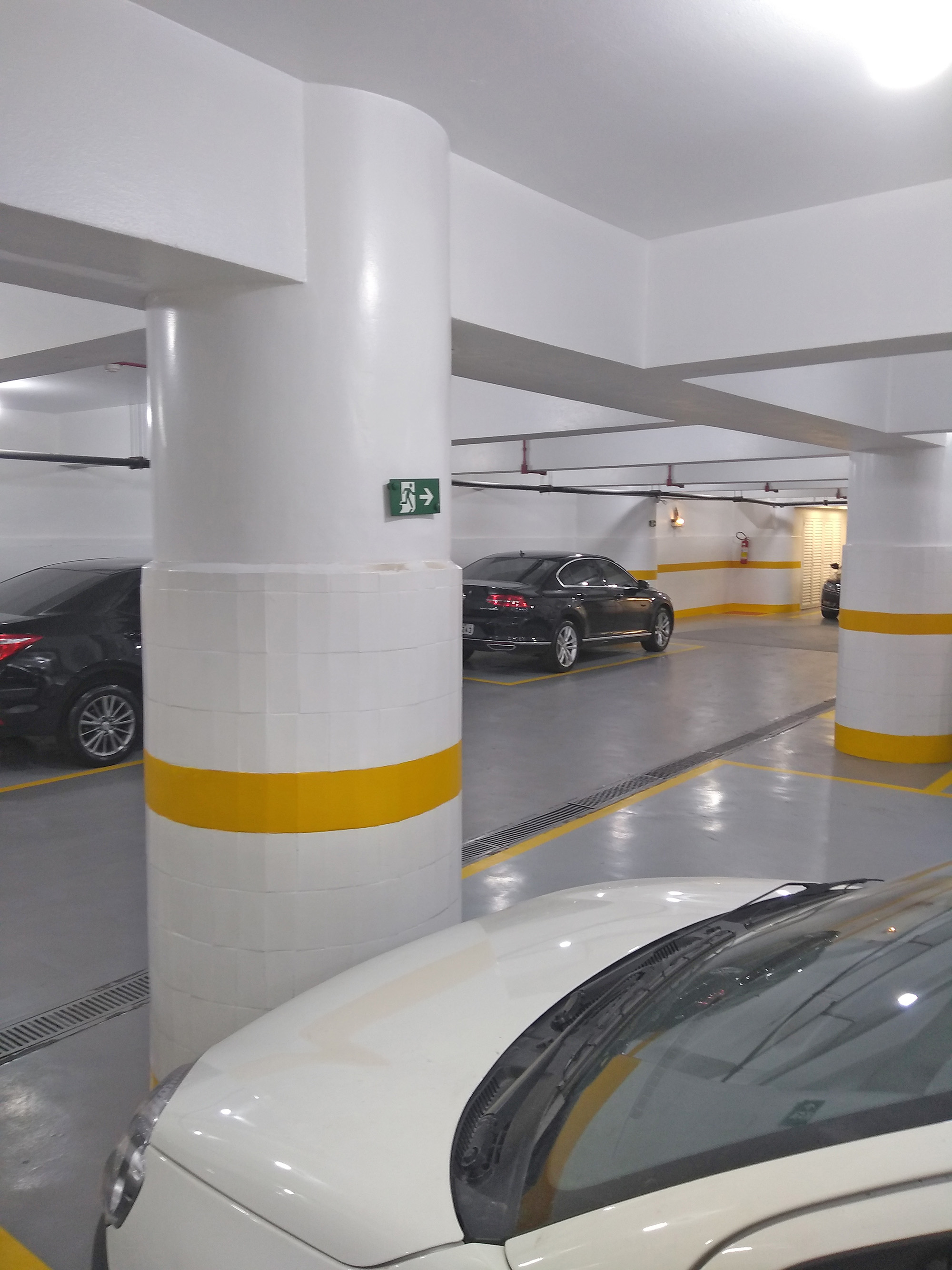
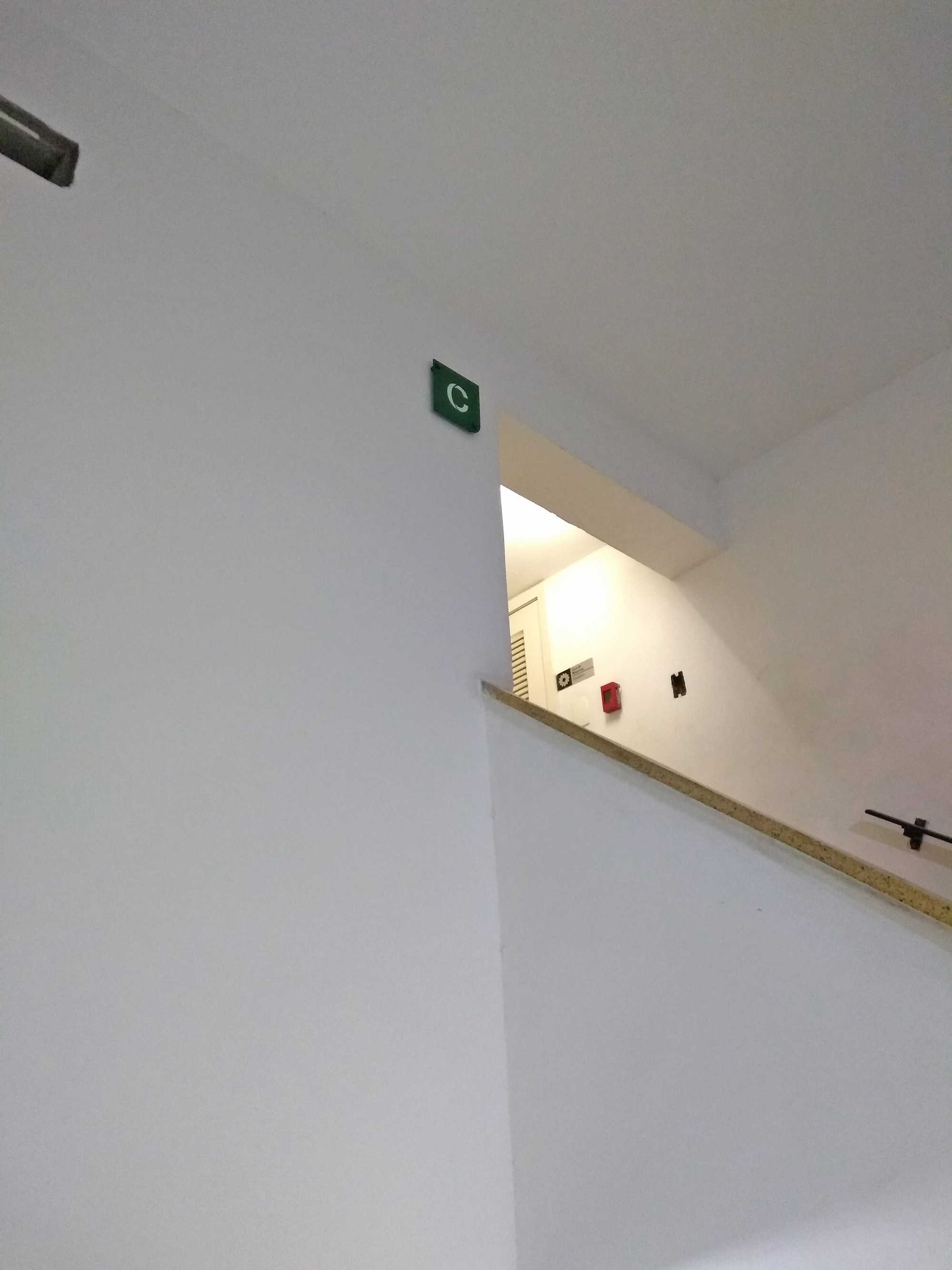
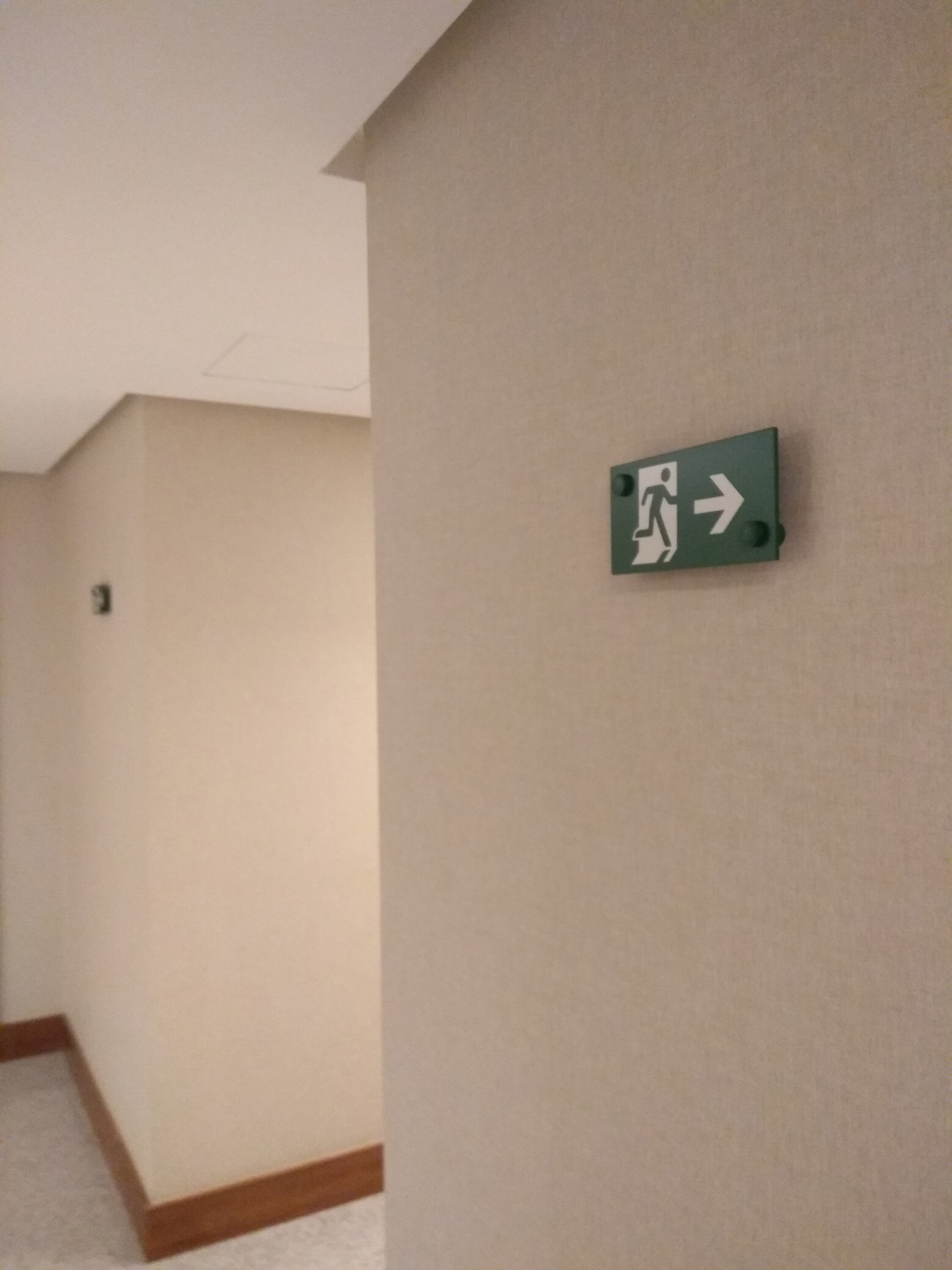
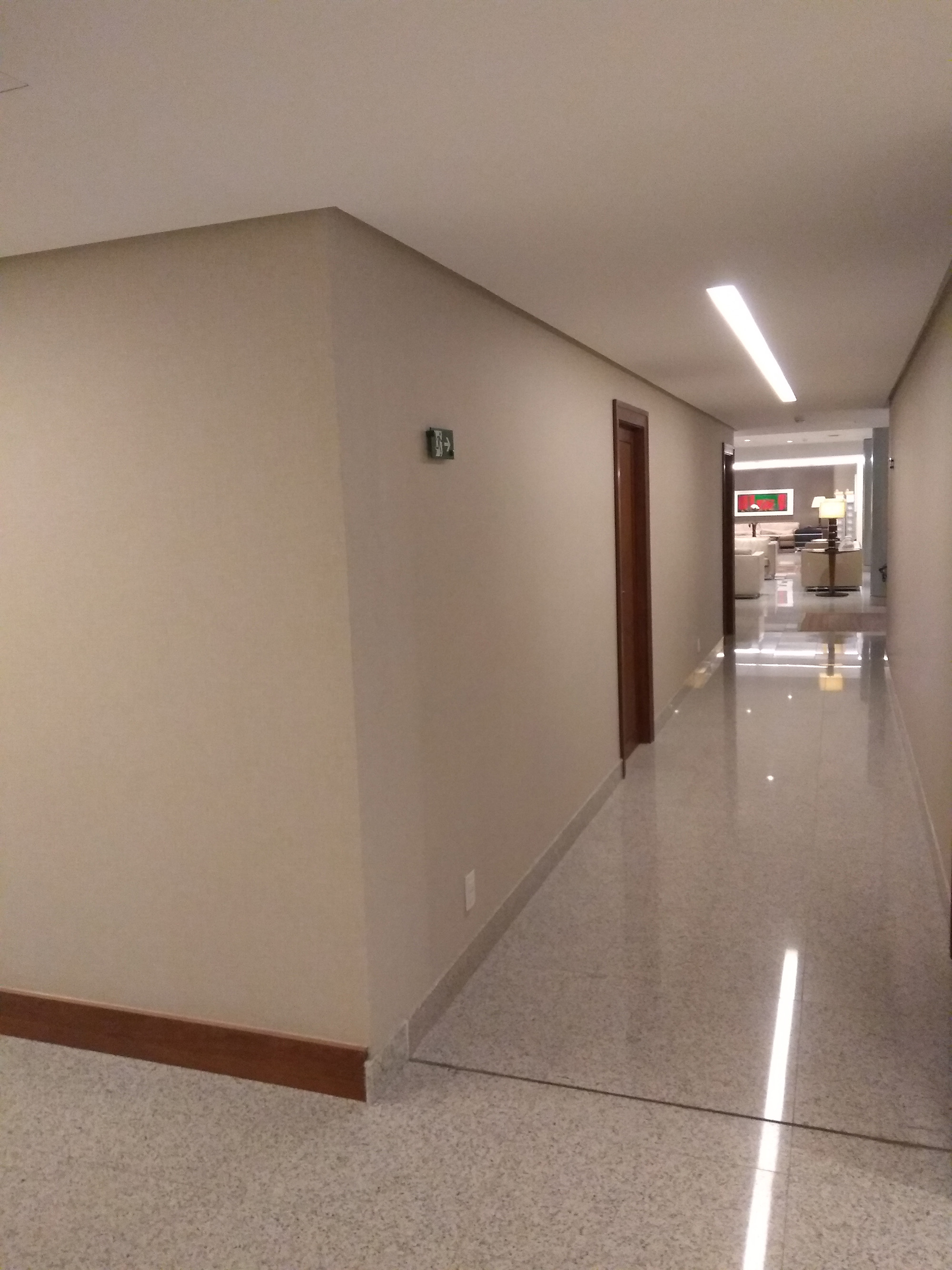
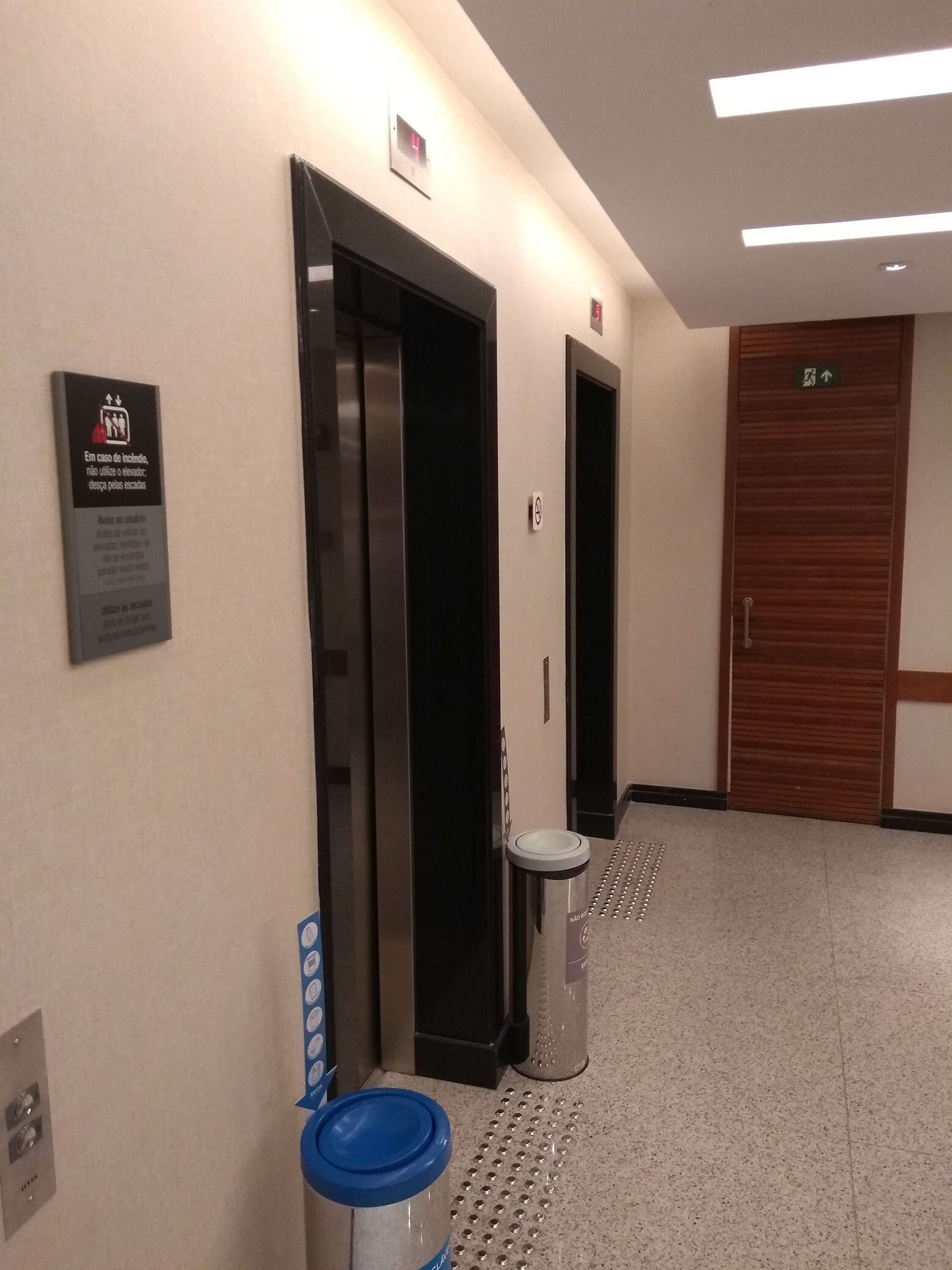
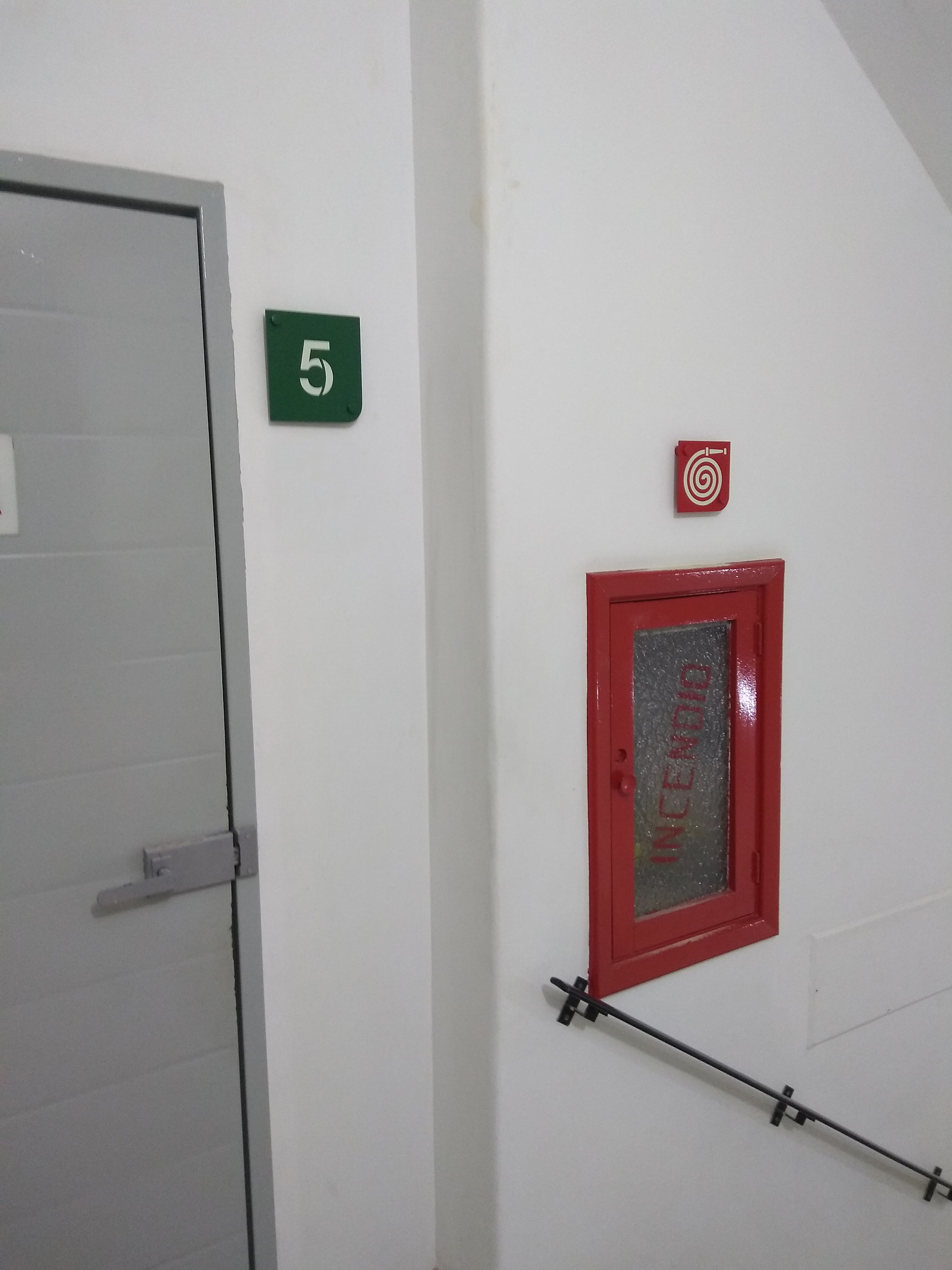
Each of these stages involved a different implementation process, technical team and level of urgency. For the emergency signage, it was necessary to hire a consultancy to assist with regulatory issues relating to the Fire Brigade and ABNT (Brazilian Association of Technical Standards) standards, whereas directional and digital signage (which also involved the IT department) were closely linked to the design project; the digital signage consisted solely of a directional display on each floor, indicating the rooms on that floor, and a directory display in the entrance hall of both buildings.
Emergency signage was installed in the Rio de Janeiro building, as the building needed to be brought into compliance with the Fire Brigade; meanwhile, directional and spatial signage was fully detailed on paper, with several prototypes, and the same applied to the digital signage.
1 National Confederation of Trade in Goods, Services and Tourism (CNC – cnc.org.br) – An employers’ trade union organisation, bringing together 34 federations across Brazil, 27 representing their respective states and 7 of these 34 operating at national level, representing over five million businesses in the trade sector that generate around 25.5 million direct and formal jobs; through its structure, it works to ensure the sector is always involved in the formulation of public policies, monitoring the progress of relevant proposals in the National Congress and defending the Constitution, always keeping in mind the laws that may impact the sector.
The CNC was founded on 4 September 1945; its president is responsible for the administration of two institutions with significant operations in Brazil, which form one of the largest social development systems in the world: the Social Service of Commerce (SESC – sesc.com.br) and the National Commercial Apprenticeship Service (SENAC – senac.br), the former with social projects such as Mesa Brasil, the Ecos Sustainability Programme, etc. (operating in the following areas: Food, Social Assistance, Culture, Education, Sport, Leisure, Health, Sustainability, etc.) and the latter providing support for the training and upskilling of employees in the commerce sector (shopkeepers, waiters, chefs, hospitality staff, etc.).


-1.jpg)