Summary:
Development of the visual identity, website and promotional materials.
Process and concept:
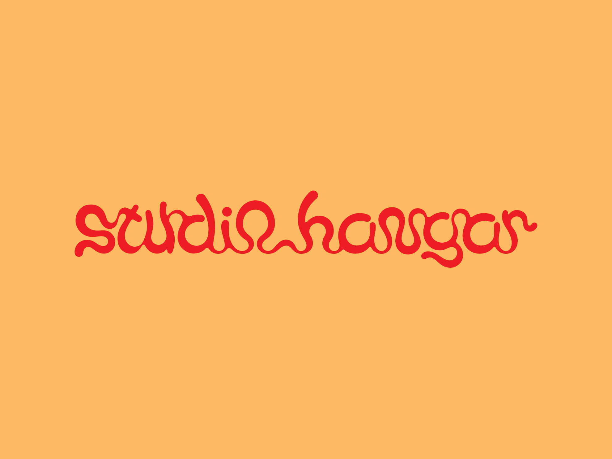
Studio – Together with another designer, João Geszti, I have set up the design Studio Hangar, a partnership that haven’t been so long; we had opened the company in late 2010 and have closed it in mid-2011. I have created this logo recently. I had suggested the name and secured the domain; João some years after has started a different career.
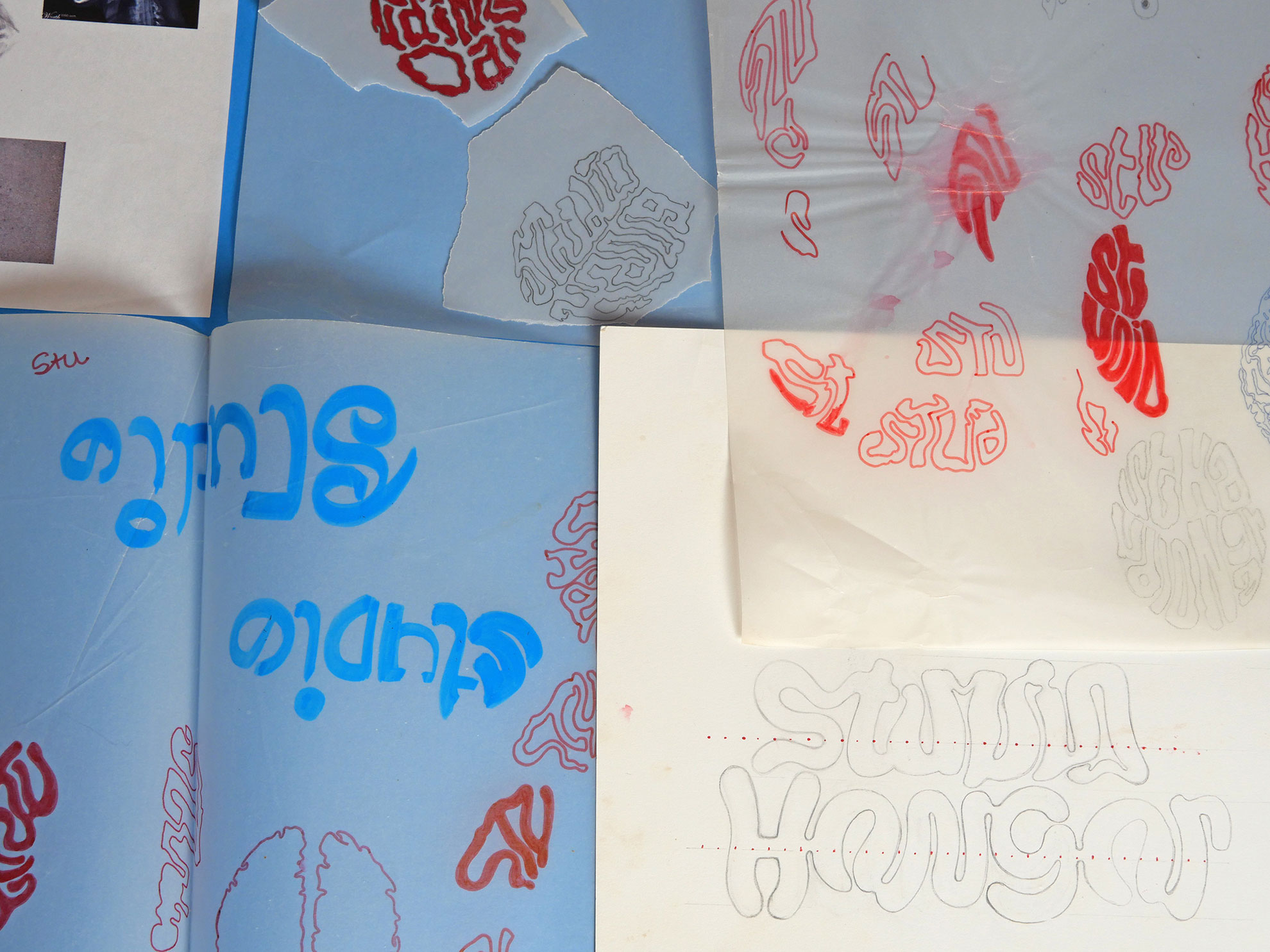
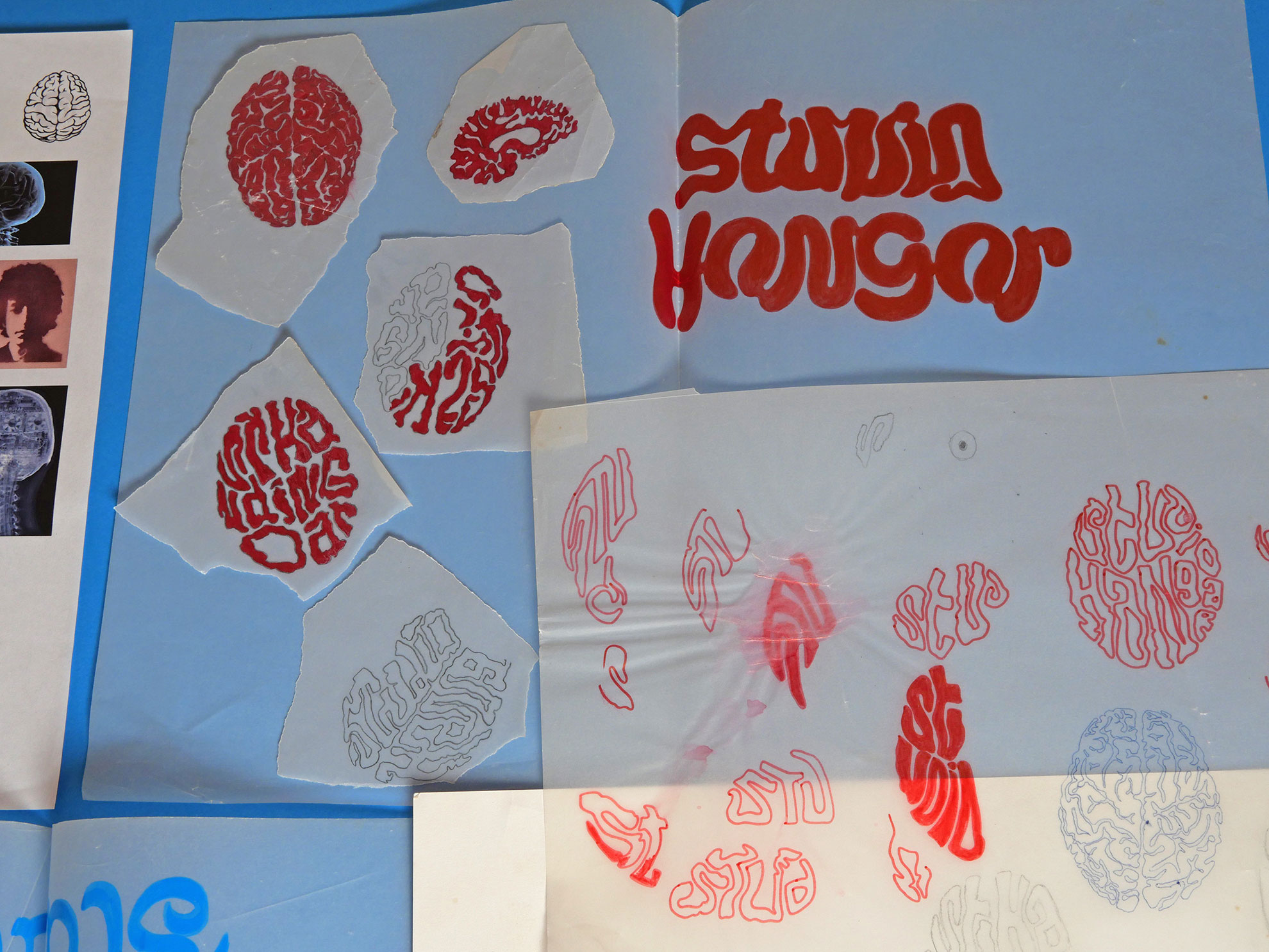
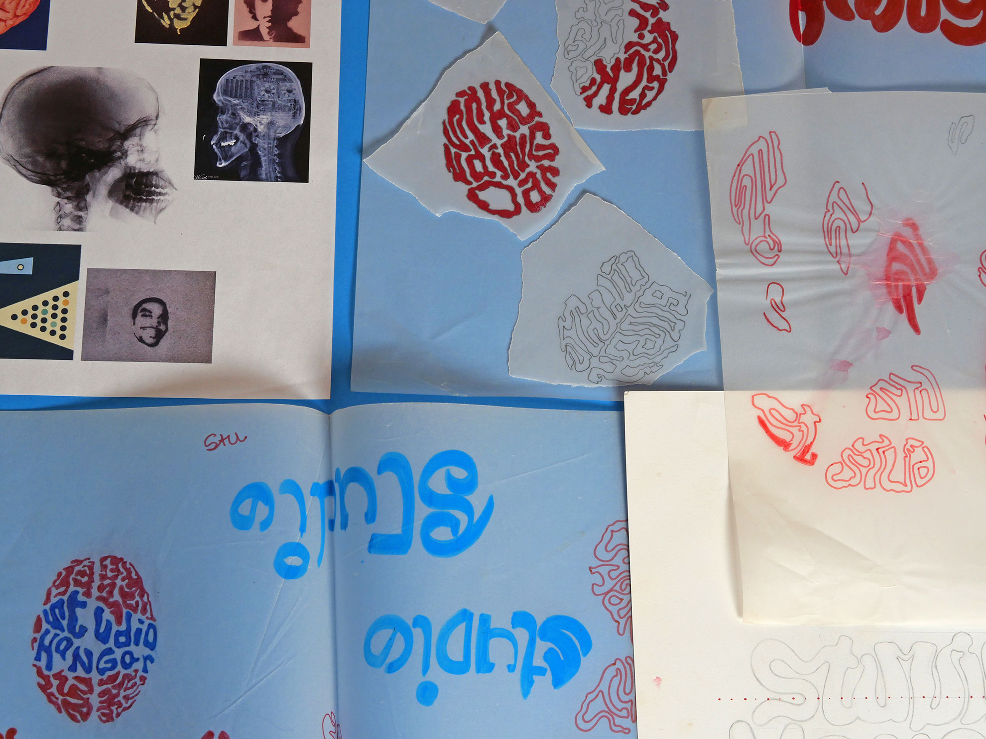
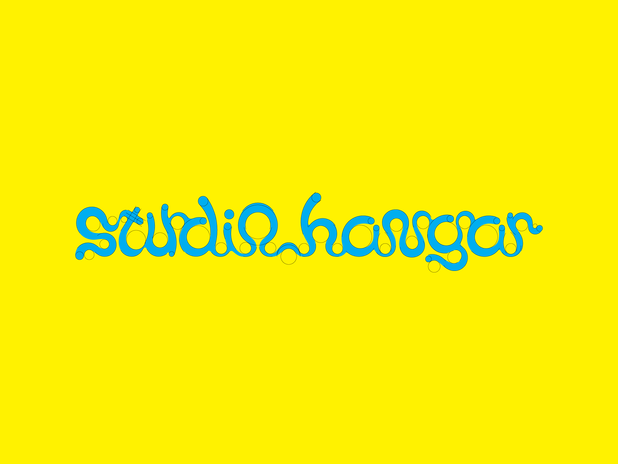
Brand – The idea behind the name, Studio Hangar, it was a place for ideas – ideas flowing in and out. The name draws an analogy with air, clouds, the sky, etc., alluding to the mind, the head, the superior part of the human body, seeking to associate the studio with creativity. To create the logo, after studying and generating alternatives, I have drawn an analogy with the brain, a ‘brain matter’ typography; however, throughout the design process, I have focused on the detail of each letter and sought the ideal readability and legibility for my eye, so I drawn heavily on the symmetry found in brand creation, for example, by Aloísio Magalhães, a leading figure in Brazilian graphic design (a designer from the 1970s), particularly in brand creation, I sought to create a completely organic logo, different from his (which is entirely constructivist), I have been generating circles and using them as a guide to ensure the curves were justified. The image number 1 shows the base markings.
Portfolio – I have set aside two days to take the images for the portfolio with the photographer Guarim de Lorena; he has taken photos of the work I had selected, examples of the projects I had done, they were many books. I had bought 180g/m² Color Plus paper in various colours, thus creating the background for each project. I have writen, edited and proofread all the texts myself; everything had initially written in Portuguese and then has translated into English. I have proofread the English texts and also translated them into Spanish and French, all using the website deepl.com, and subsequently made the necessary adjustments to the texts.
Website – I have quickly created an initial layout, using the website – velvet spectrum.com (the old version of this site) – as a reference, with the dimensions and the number of images to be included on the homepage, etc., for the meeting with the programmer Fábio Silva. Fábio has handled the development in ASP.NET; he has worked on the project for a few months and created the entire back-end of the website.
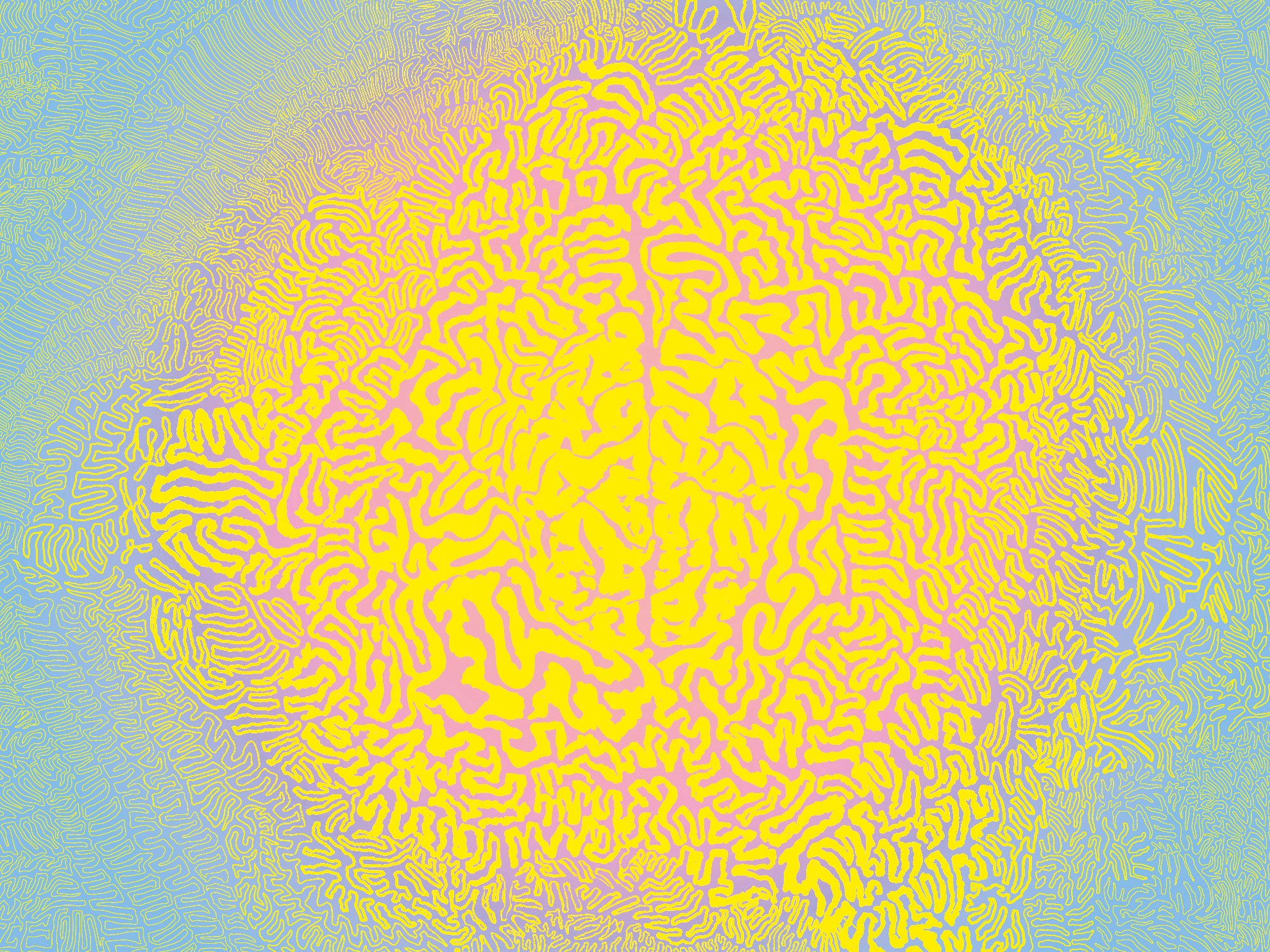
I have created an image that appears on the contact page: a brain texture, an element alluding to the initial ideas conceived for the brand, spreading out in all directions.
 1
1
 3
3
 2
2